Options in this list start with a single sheet of stainless steel and no grout lines, and end with herringbone and mosaic work that takes patience; cost and effort rise with every cut and grout line.
Renters and anyone who may move soon should pick a neutral tile, like the one in the Neutral Tiled Accent Wall idea, since it outlasts a cabinet change; a bold square tile in a brave color belongs in a room you’ll keep.
1. Glass Tiles
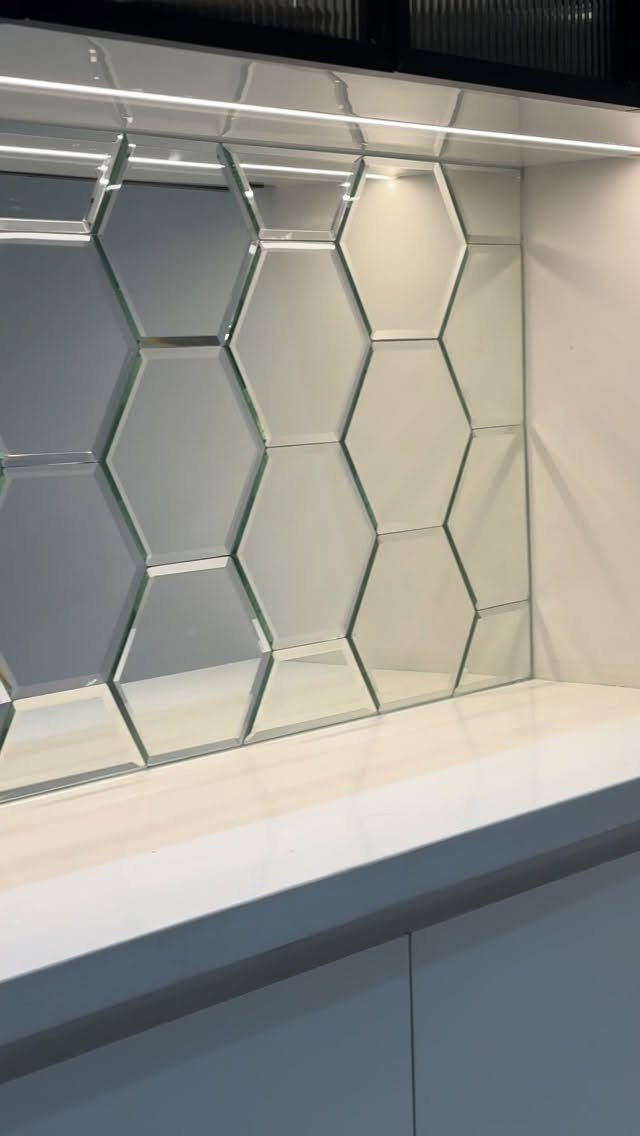
Mirrored hexagonal glass tile throws light back across the wall, which is why it suits a laundry room with little daylight. Pair it with under-cabinet lighting and the surface picks up every bit of it.
Glass shows water spots and detergent splashes, so expect to wipe it down more often than matte ceramic. I’d keep it to the stretch of wall above the countertop, where it stays visible and the cost stays modest.
2. Stainless Steel
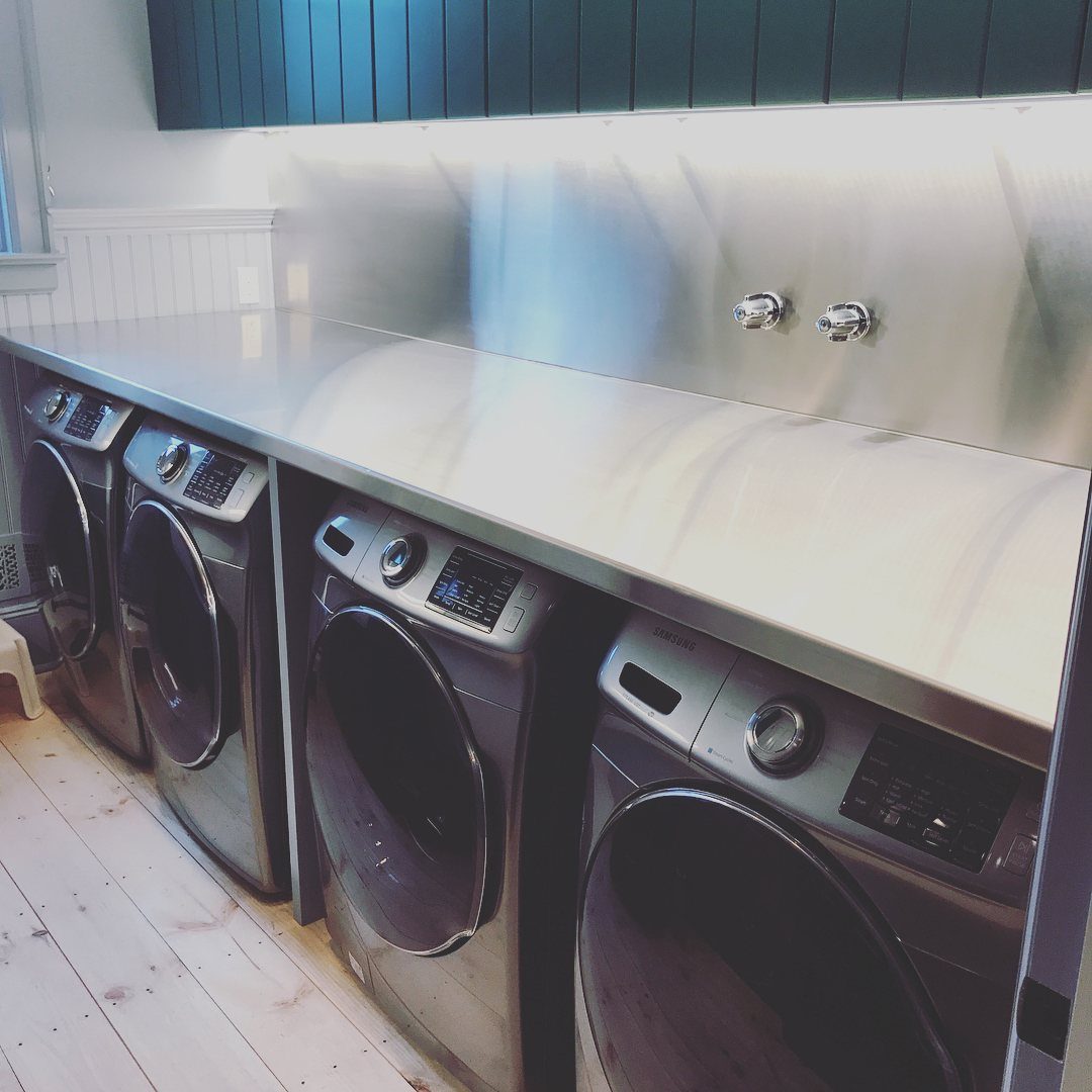
A stainless steel backsplash behind a row of front-loading machines looks like a commercial laundromat, and I like that. One sheet runs from countertop to wall with no grout lines to scrub.
It pairs well with painted cabinets in a color, since the metal stays neutral.
Fingerprints and water marks show, so keep a microfiber cloth nearby. Expect a cool, industrial feel rather than a cozy one.
3. Subway Tiles
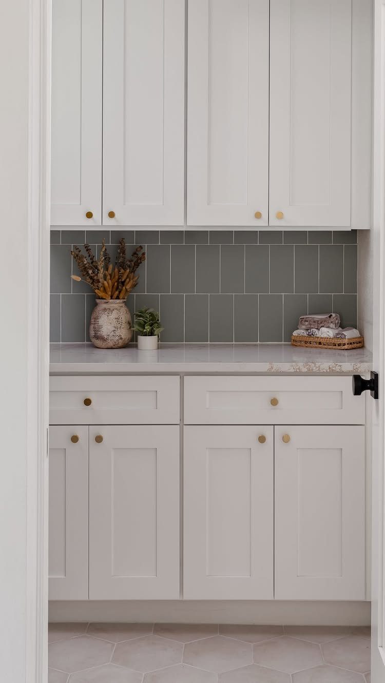
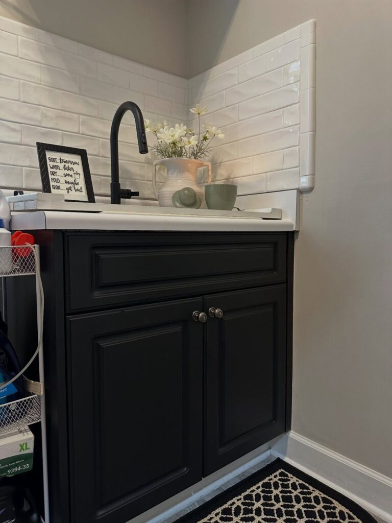
A 3×6 subway tile in a color costs little, and that’s the version I’d pick for a weekend budget.
The maker of this grey example suggests an inexpensive colorful 3×6 in a vertical offset or horizontal stack, and either layout reads as intentional.
Setting the tiles vertically stretches the wall upward between white cabinets.
A stack keeps the grout lines clean and graphic. Choose a grout shade close to the tile for a calm look, or a contrasting one if you want the pattern to show.
4. Mosaic Tiles
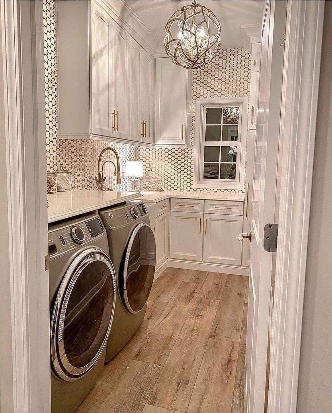
White honeycomb mosaic gives a plain laundry wall some pattern without adding a single bold color. A neutral mosaic in soft white or gray reads quiet next to white cabinets and brass hardware, and it still looks planned.
Small tiles mean more grout lines, so the surface takes longer to clean than large-format tile.
Mosaic sheets are easier to set than individual pieces, which helps a first-time tiler. I’d keep the grout light so the shape stays soft.
5. Vintage-Inspired Tiles
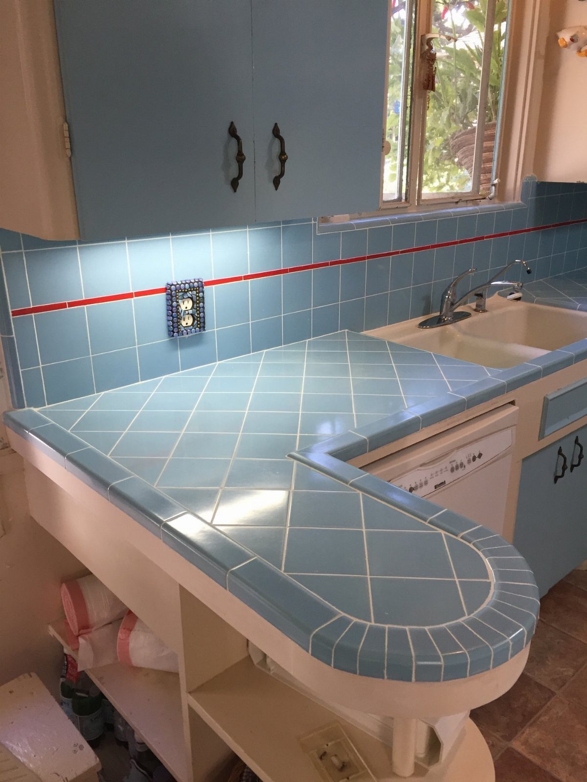
Blue cabinets echo the tile nicely. Tiling the counter as well as the wall costs more in material and time, so if the budget is tight, start with the wall alone.
6. Herringbone Patterns
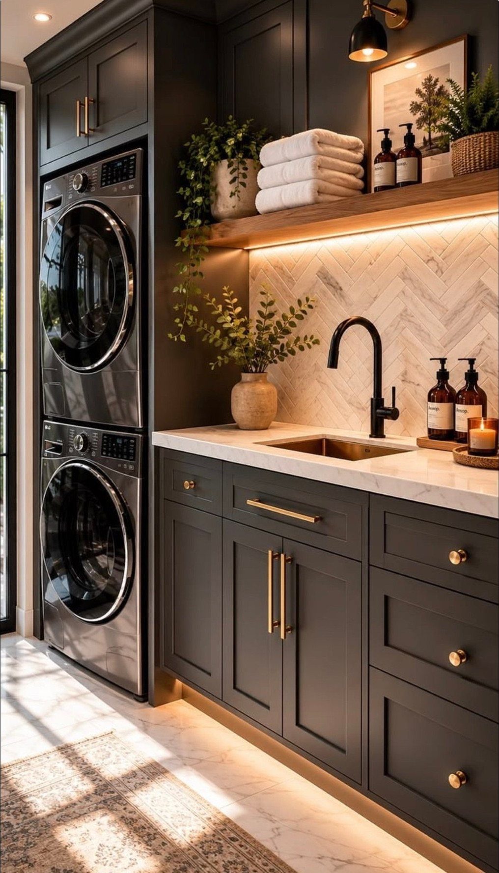
Herringbone turns a plain white tile into movement, and against dark grey cabinets it looks sharp. A marble version like this one suits a laundry room that has a stone countertop already.
The zigzag layout takes more cuts at the edges than a straight stack, so buy extra tile to cover waste.
Mark a centerline before you set the first piece and work outward. It’s a patient job, but one weekend can handle a small wall.
7. Vertical Tile Backsplash
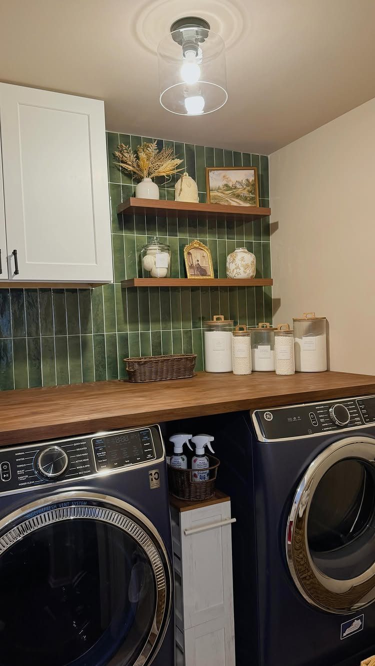
Green tile stacked vertically pulls the eye up the wall, and a warm wood countertop keeps all that color from feeling cold.
Vertical stacking uses the same tile as a horizontal layout, so the material cost doesn’t change. I’d run it to the underside of the upper shelves and keep the grout close to the tile color.
8. Kit-Kat Finger Tiles
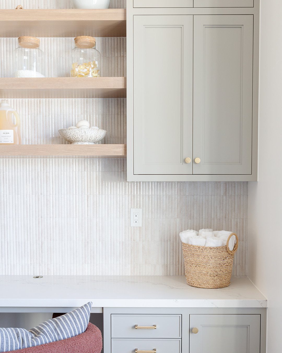
Slim white finger tiles set on end give a laundry wall fine vertical lines without adding any color. Against grey cabinets and a light marble counter, they read clean and a little softer than standard subway.
The narrow shape means plenty of grout lines, so choose a light grout and expect a bit more wiping.
Sheets on a mesh backing cut the layout work to almost nothing, since spacing is already set, so a first project goes faster and the lines stay straight.
I’d stop the tile at the bottom open shelf so the cuts stay simple.
9. Bold Square Tile Backsplash
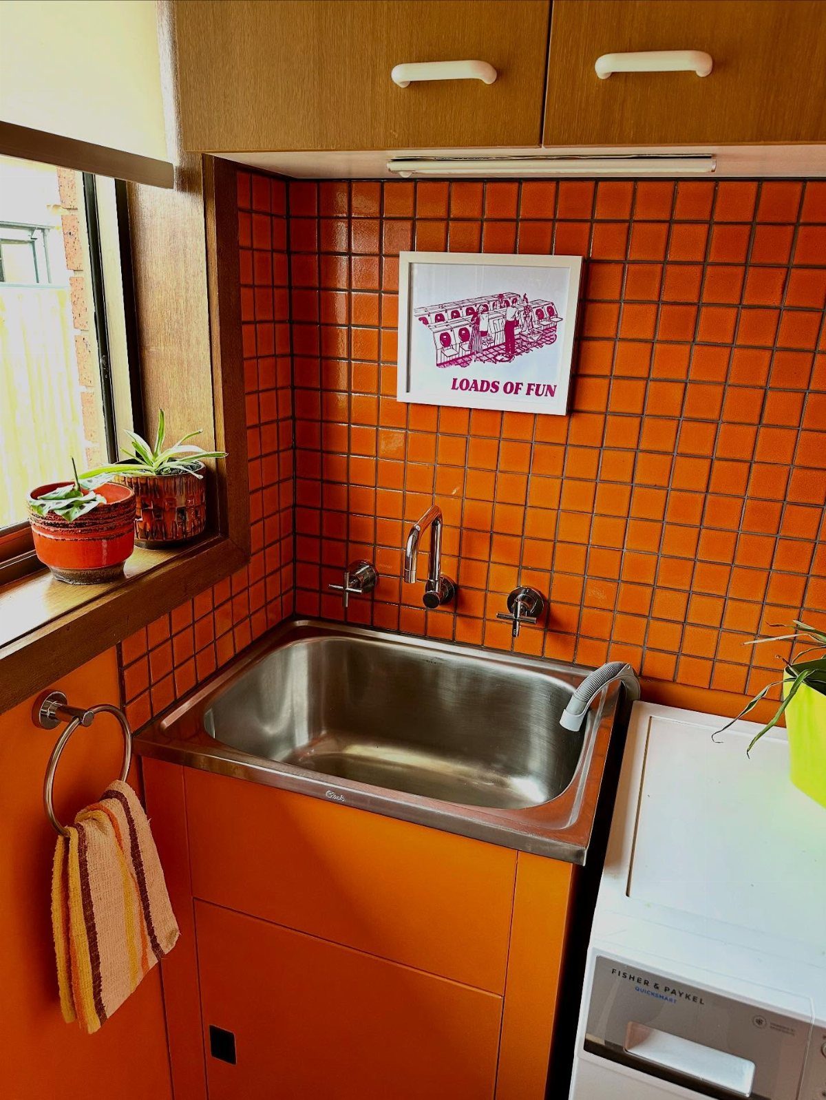
Orange square tile is the pick for a laundry room that should make you smile while you sort socks.
Behind a stainless sink and a white machine, one saturated color does all the work, and nothing else needs to be loud.
Keep the rest of the wall plain.
A grout close to the tile shade makes the orange look like one solid surface, while white grout turns it into a grid. I’d pick one and commit.
10. Neutral Tiled Accent Wall
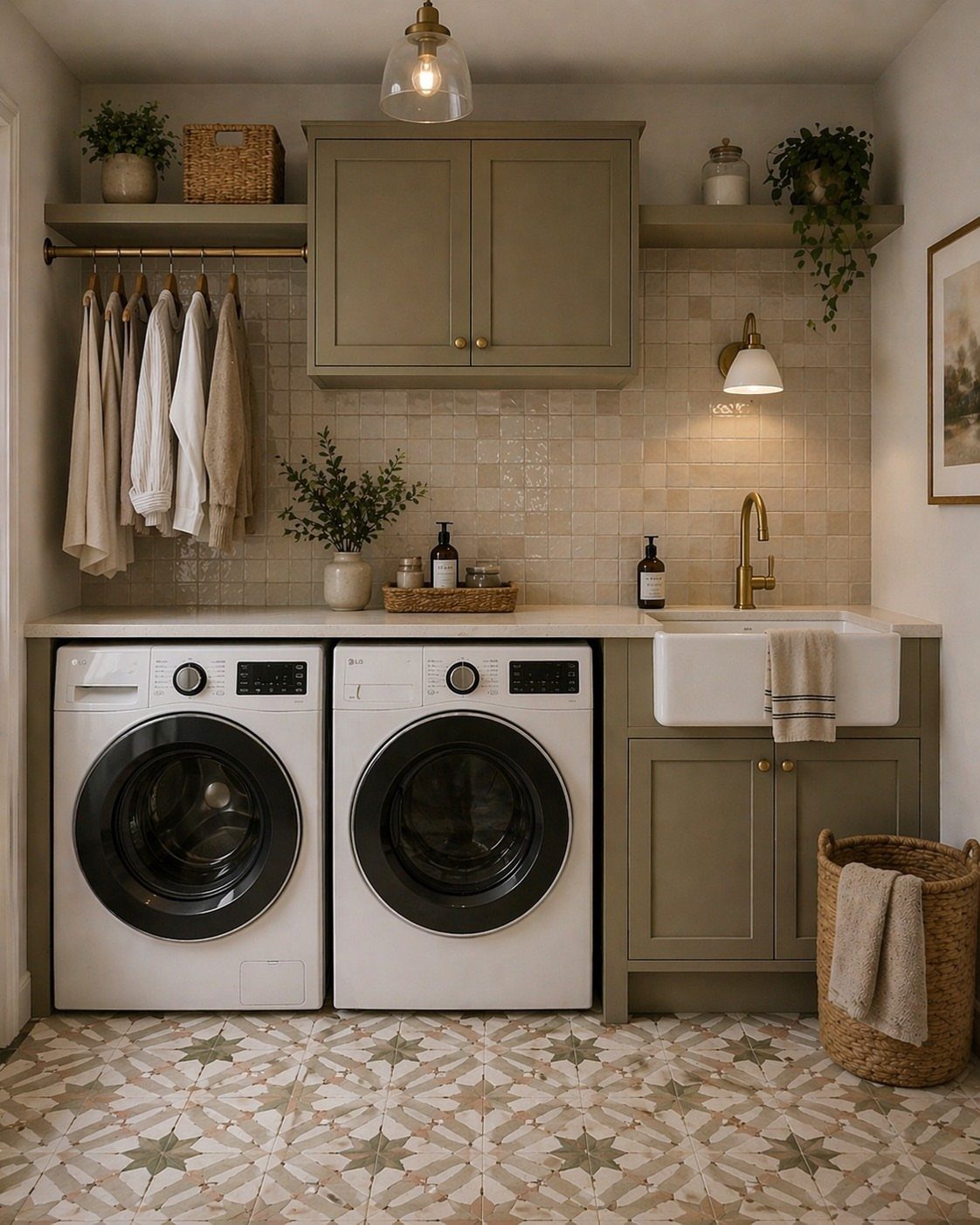
Soft beige square tile running the full height behind the counter makes a quiet backdrop for olive cabinets and a farmhouse sink. It lets the cabinet color lead and keeps a busy floor pattern from fighting the wall.
A tiled wall that covers the whole space behind the counter needs more tile than a short splash, so measure carefully and add extra for cuts. Warm, low-contrast grout keeps the surface calm.
11. 3D Textured Tiles
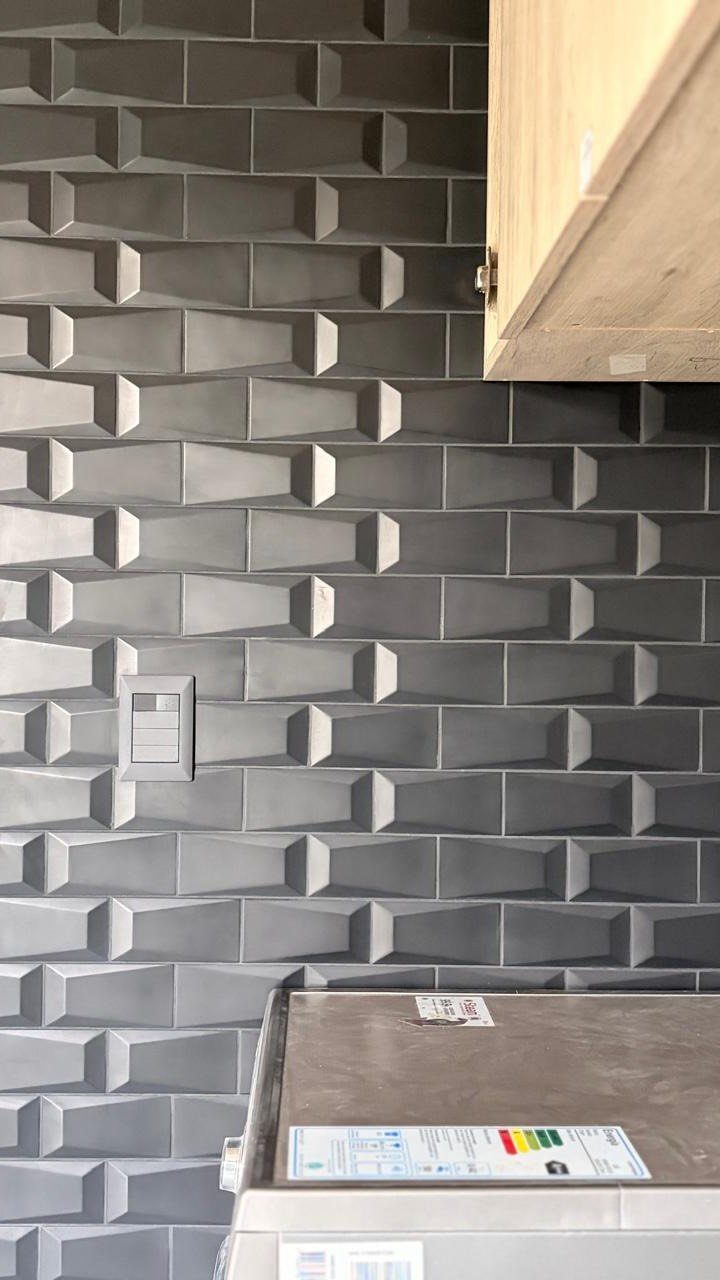
Grey 3D tile gives a laundry wall real depth, and the sculpted surface catches light differently through the day. It makes a plain washer corner look finished with just one material.
Raised surfaces hold lint and dust, so expect to brush or wipe them more than flat tile.
Cutting around a light switch takes care, so plan that edge before you start. I’d use it on a small wall, not the whole room.
12. Geometric Patterns
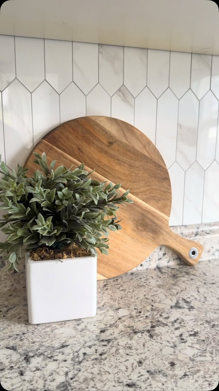
A white marble-look hexagon tile gives the wall a geometric pattern while staying neutral, which makes it easy to live with next to a granite countertop. The shape adds energy without any bold color.
Marble-look tile gives the stone effect for less than real marble, and it needs no sealing the way natural stone can.
Pick a grout close to the tile color, and the pattern reads as a quiet texture instead of a busy grid. Start from a centerline so the hexagons sit evenly at both ends.
Installation Tips
Start with the wall. Scrub off lint, soap film and grease, let it dry fully, and patch any dents so the tile sits flat.
Dry-laying your backsplash tiles on the counter or floor before you apply any adhesive shows you where the cuts fall, and you can shift the layout so you don’t end up with thin slivers at an outlet or corner.
Spread the adhesive with a notched trowel over a small section of wall, then drag the trowel’s teeth through it to leave even grooves.
Those ridges help the tile grip. Working in small patches keeps the adhesive from skinning over before the tile goes on.
Press each piece in with a slight twist, and check for level every few rows. Slow, careful setting is what gives the finished wall a professional look.
Maintenance Advice
Clean the backsplash on a regular schedule with mild detergent and warm water. Skip abrasive cleaners and scouring pads, since they dull and scratch the surface.
Wipe up splashes as soon as you see them. Detergent and bleach left to dry can stain, and standing water is how damage starts.
Every few months, look over the grout lines for cracks or gaps. Repair them promptly, because moisture that gets behind the tile causes bigger problems than the cracked grout ever would.
A small bottle of grout sealer and a weekend afternoon cover a typical laundry room backsplash, and a fresh coat every year or 2 keeps splashes from soaking into the grout lines.
Choosing Colors
Look at the colors already in the rest of your home before you pick tile. A laundry room that echoes the hallway or kitchen palette feels connected, while a clash can feel like a separate house.
Bright colors energize a room used for chores, which makes the work feel lighter. Neutrals offer a timeless look and stay easy to live with when your taste or your cabinets change.
If you rent or may move soon, lean neutral. If the room is yours for the long haul, one brave color is easy to justify.
Carry a tile sample to the room and look at it in morning and evening light before buying.
Frequently Asked Questions
Should you put a backsplash in a laundry room?
Yes, especially behind a sink or machines.
A backsplash shields the wall from water, detergent and humidity, which helps prevent moisture damage and mold. It also wipes clean easily and gives a plain laundry wall some style.
What tile is best for a laundry room?
Porcelain or ceramic tile is the best choice. Both absorb very little water, so they resist moisture and mold, and glazed versions tend to clean up more easily than unglazed ones.
Porcelain printed to look like marble gives you the veining without the sealer that real marble asks for every year or two, and it shrugs off detergent splashes.
What is the new trend in backsplash?
Bold colors and unusual patterns are the current direction.
Saturated tile, such as a single orange or green, can carry a whole laundry wall while everything else stays plain. Patterned layouts like herringbone and hexagons add interest too.
Renters and anyone planning a move in a couple of years should keep the tile itself quiet, in white, greige, or soft gray, and put the trend color into paint, a shelf, or a basket instead.